Edmonds Community College Rebrand
Brand Identity and User Research
Role
Art Director
Industry
Higher Education
Duration
~3 months

Overview
Edmonds Community College had a brand problem hiding in plain sight. Their existing logo was blocky, stiff, and widely described as looking like a transit logo. Their athletic marks were inconsistent and disconnected from the institutional identity. With enrollment declining and three nearby community colleges competing for the same students, the stakes for getting the rebrand right were high.
Red Rokk won the project through a competitive RFP process. As Art Director, I led the visual design direction, co-facilitated the focus groups, and built the brand survey that would drive our design decisions. What started as a comprehensive rebrand became something more complicated mid-project — and the most important design contribution I made wasn't the one I planned on.
The Research
Before any design began, we ran a 13-question brand survey with 933 respondents across students, faculty, alumni, and community members. I led the brand-specific portions, focused on logo preferences, color direction, mascot attributes, and how the community perceived EdCC's identity and competitive position.
The data told a clear story. When asked what made EdCC stand out, 41.8% described it as a college where all cultures and backgrounds are openly accepted, and 27.1% pointed to its international focus — the third highest number of international students in Washington State. Inclusivity wasn't just a value; it was the college's defining characteristic in the eyes of its own community.
On the visual side, respondents favored a combomark logo format (31%), with direction pointing toward modern, simple, and organic. For the mascot, the top priorities were modern (22.6%) and simple (21.5%). Color preferences leaned toward a blue-forward palette with contrast.
We followed the survey with moderated focus groups across three audience segments — students, faculty/staff, and community members. The qualitative findings sharpened what the numbers suggested: the existing logo felt unwelcoming and had no sense of place. The athletic marks were too busy and disconnected from the institutional brand. The word that kept coming up: pride.


The Design Direction
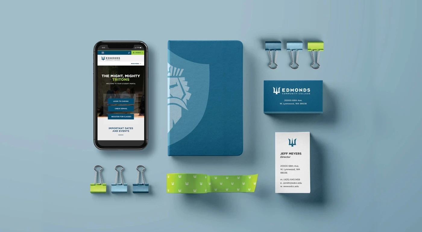
Armed with that research, I designed a new institutional logo built around a modern trident mark — fluid, strong, and designed to stand on its own as an icon. The direction moved away from the rigid all-caps lockup of the original toward something with curves, movement, and a clear sense of identity. The color system followed the survey: a blue-forward palette with a lime green accent for contrast and energy. The athletic identity was redesigned to unify around the trident, creating a clear visual thread between the institutional and athletic brands.
The Challenge
One of our designers developed a highly detailed, illustrated Triton figure for the mascot — a reimagined character that moved from rough sketches through low-fidelity to a polished final comp. The work was strong. The problem was process.
The EdCC rebrand committee hadn't brought the college president into the review until we reached the final hi-fidelity stage. When she saw the mascot — a detailed illustration of a muscular, white male figure with a pitchfork — she stopped it immediately. The imagery didn't align with the college's identity as an inclusive, welcoming institution for people of all backgrounds.
EdCC didn't want to abandon the Triton mascot entirely — it had history and meaning on campus — but the figure as illustrated wasn't going to work.


The Solution
Behind schedule and needing to move fast, I dove into rapid sketching to explore the new direction. Through quick iterations, I landed on a Triton face rendered in a simple, modern, monochromatic style using two shades of blue. By reducing the mascot to a stylized face — removing the body, the skin tone, the imposing pitchfork — the design stayed true to the Triton identity while eliminating the elements that made it exclusionary. The result felt fierce, modern and collegiate without centering a specific type of person.
The trident carried through as a subtle symbol in the crown, tying back to the institutional logo and creating the unified visual language the focus groups had asked for.
The Outcome
The rebrand launched successfully. I designed the comprehensive brand guidelines and handed off to EdCC — covering logo usage, color system, typography, mascot applications, and brand voice. It gave the college a cohesive identity system for the first time, built directly from what their own community said they wanted.
The client relationship didn't end there. EdCC brought Red Rokk back immediately for a second project: three websites targeting three distinct audiences — faculty, current students, and prospective students — all built and delivered in four months.
Enrollment grew roughly 7.1% the following academic year — a result of many moving parts, this work among them.


