Sunday AI Yard Companion App
0→1 iOS + Android App Design
Role
Lead Product Designer
Industry
Yard Care Subscription
Duration
4-6 months

Overview
Sunday's lawn plan subscription was built on the web — but subscribers needed a mobile experience to match. The opportunity: meet them where they already were, close the gap between receiving a product delivery and knowing what to do with it, and put an AI lawn expert in their pocket. We built the Sunday Lawn Care Companion app from zero to App Store submission in four months — a subscriber-only iOS + Android app with an AI yard companion (Sunny), a personalized task checklist, push notifications, and photo diagnostics. I was the sole designer, working as part of a product trio with one PM and one engineer.
The Challenge
Subscribers loved their lawn plans, but using them on mobile was underserved. They had a checklist on web, but needed something faster and more intuitive — answers in the moment, standing in their yard. The goal: design and ship an MVP that reduced uncertainty, drove engagement, and improved retention before the spring growing season.
Designing the Checklist
Sunday's lawn plan checklist is the heart of the product. It's what subscribers use to know what to apply, when, and how. On web it worked, but on mobile it needed to do more.
The checklist can get long — subscribers may have multiple products across a full season. My first design organized tasks chronologically, which felt logical but turned out to cause problems in testing.
User Research
I ran unmoderated usability tests through UserTesting.com on an early checklist prototype. A few things surfaced quickly:
Task status was unclear. Users couldn't easily tell where they stood in their plan. It wasn't just about marking things done — they needed proactive statuses like Upcoming and Start Now to motivate action and create a sense of urgency around the right tasks at the right time.
Application timing was confusing. I'd included a slider to show how many days remained within the application window — meant to create urgency. Testers ignored it or misunderstood it. It was adding visual noise without adding clarity.
The progress slider wasn't landing. Application windows now show as date ranges (e.g., "May 2–9 · Apply 1 bag"), making it immediately clear this refers to a window — not a daily action.
Chronological ordering buried what was most relevant. One tester's feedback got me thinking: the most useful thing isn't what's coming up in three months, it's what needs to happen this week.
What Changed
Based on those sessions, I restructured the checklist significantly:
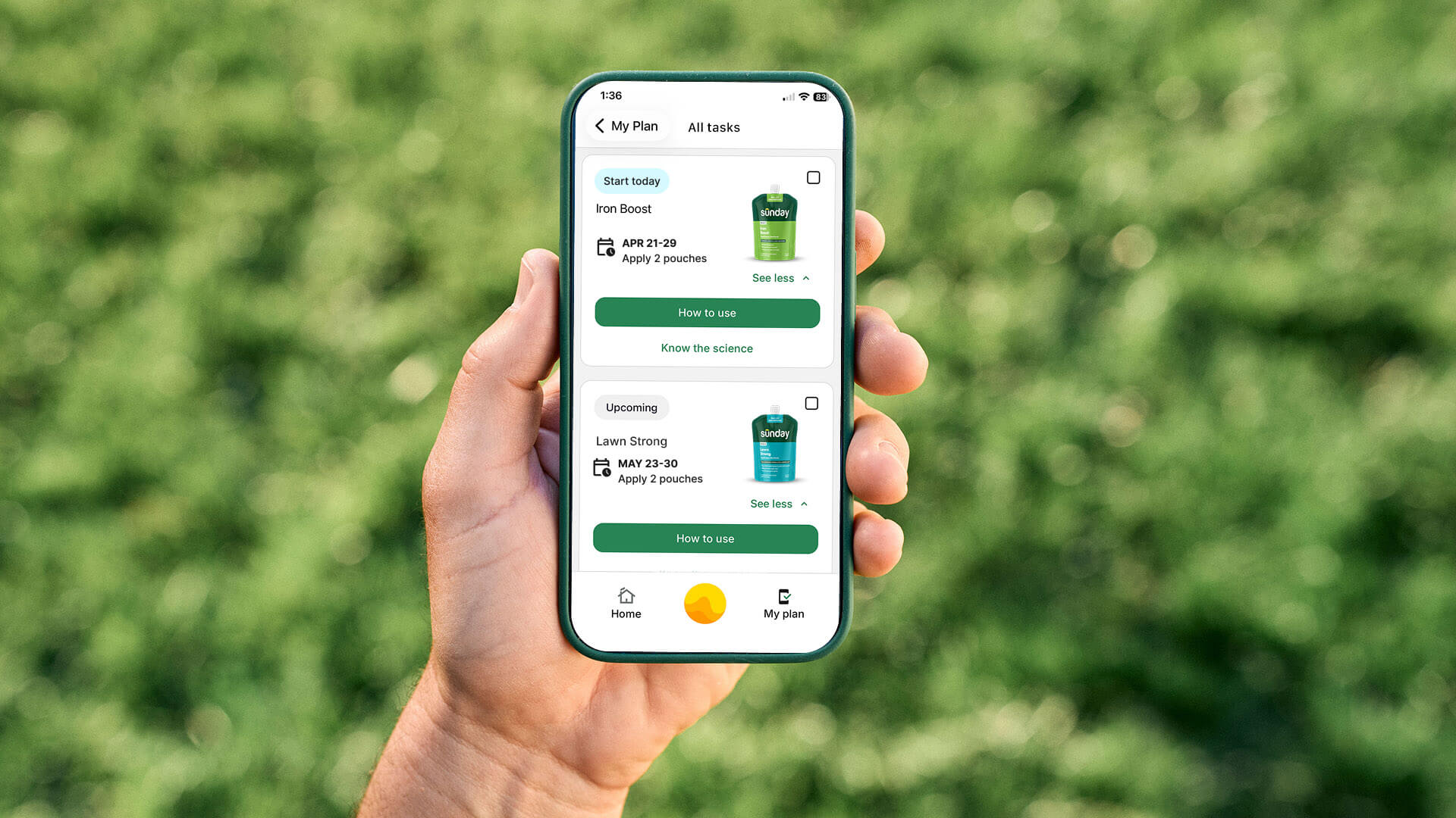
Categorized task states. Rather than a flat chronological list, tasks are now organized into clear buckets: Upcoming / Start Now, Overdue, Done, and See All. This puts the most actionable items front and center and lets subscribers quickly understand where they stand in their plan.
Removed the slider. The progress bar concept was replaced with a simple, plain-language label: "4 days left." No interpretation needed.
Renamed "Apply Time" to clear date ranges. Application windows now show as date ranges (e.g., "May 2–9 · Apply 1 bag"), making it immediately clear this refers to a window — not a daily action.
Added product-level guidance. Based on research showing subscribers wanted to understand the why behind their plan, each product now includes a "How to use" button with step-by-step instructions and a "Know the science" link explaining the product's purpose.
Home screen widget. I designed a compact widget on the home screen that surfaces just the subscriber's next two upcoming applications — the most relevant information without requiring them to open the full checklist.


Designing the Sunny AI Experience
Sunny combines AI with Sunday’s lawn care expertise to deliver personalized recommendations and photo-based issue diagnosis tailored to each subscriber’s yard. I designed the end-to-end experience, including the chat interface, photo upload flow, and the presentation of AI-generated guidance throughout the app. A core challenge was helping users understand Sunny’s capabilities, provide the right context, and trust the recommendations they received.
Chat Interface & Visual Voice
Given our timeline, we parallel pathed design and engineering — the engineer began building core flows while I was still working through the visual design, then we'd sync and he'd style to my final specs. The early Sunny chat reflected that process: a functional but unstyled interface with plain text bubbles and no brand presence. I built Sunny a distinct visual voice: a warm cream-toned response card, and a chat input bar with a persistent camera icon for photo uploads.
Photo Diagnostics
The photo diagnostic flow was one of the most engaging features in the MVP — subscribers could take a picture of a lawn problem (a yellow patch, weeds, bare spots) and get a personalized, step-by-step response from Sunny. What made it resonate wasn't just the convenience — it was the intelligence behind it. Sunny could identify issues, account for the subscriber's specific grass type, location, and existing plan, and respond with advice that felt genuinely tailored. For subscribers who'd always felt uncertain about what was actually wrong with their yard, it was a confidence-builder. This feature drove 14,000+ image uploads within the first days of full rollout.
Geo-Personalized Prompts
Sunny's home screen surfaces questions trending among neighbors in the subscriber's city — making the experience feel alive and locally relevant without any extra effort from the subscriber.
Navigating the Apple Roadblock
One of the more challenging moments in the project didn't come from the design — it came from the App Store.
Our original plan was to distribute the app as unlisted on Apple — live but not searchable, accessible only via direct link — keeping non-subscribers from hitting a login wall. Apple declined. We pivoted to a public listing and built a careful staged rollout: 25% of subscribers, then 50%, then 100% — using each phase to triage bugs and align communication so subscribers knew the app was for them. The launch email became our highest click-through campaign.
We shipped 7 days late due to the Apple review process, not design or engineering — and by the time we hit 100%, nearly all major bugs had already been resolved through the staged rollout.


Results
The numbers below are from the full rollout period (Mar 26 – Apr 21), with the app reaching 100% of subscribers on Apr 9:
32.3k total downloads — in 27 days
83.9% onboarding completion rate — and climbing post accessibility fixes
Highest email click-through rate of any campaign at Sunday
53.8k Sunny messages sent — 42% of all Sunny messages now happening inside the app, up 100% YoY
102.1k My Plan actions — how to use, tasks, and science content all actively engaged, doubling week over week
57k "How to use" taps — most popular in-app action
21.1k "Know the science" taps — validating the research-driven decision to add educational content to each product
24k tasks updated — subscribers actively working through their plans
14.45k Sunny messages with images sent — photo diagnostics driving real engagement
Retention tracked at or above industry benchmarks across Day 1, Day 7, and Day 14 — early signal that the app was building real habit, not just curiosity downloads
Reflections
Scope is a design decision
Shipping a 0→1 app in under four months with a product trio is an exercise in radical prioritization. Every feature decision came with a tradeoff, and the PRD's "non-goals" list was as important as the feature list. Intentional scoping — deferring guest mode and in-app checkout — is what made on-time delivery possible.
Test early, even on simple interactions
The user testing on the checklist was a reminder that even the simplest interactions deserve validation. A progress bar I thought would create helpful urgency was creating confusion instead. Talking to six users before finalizing that design saved significant rework down the line.
Distribution decisions are UX decisions
If I could go back, I'd advocate earlier for resolving the Apple distribution question as a design problem, not just an engineering or ops one. The unlisted vs. public decision had real UX implications — and had we aligned on it sooner as a team, we would have had more time to design a better leads-to-subscribers handoff within the app itself.
Test accessibility at the extremes
The accessibility issues we caught post-launch were a good reminder to test at the edges. About 20% of subscribers use enlarged font sizes, and at the largest system settings, a button in the onboarding flow became unreachable. We tested for accessibility, but not at the biggest end of the scale. We caught it through the staged rollout and shipped a fix quickly — but it's now something I build into QA from the start.


